Installed the OSX Mavericks on a Macbook Air and a Mac Mini yesterday and here’s initial impressions on the most salient features and why it’s for the hyperactive mental butterflies.
 #1 – dig the fact it’s FREE after the 20 sheets we had to outlay for a Mountain Lion which was a purely under the bonnet release (the classic IT developer “technical debt/architecture” release punted out to a screaming CFO – “where’s the capability uplift for the million bucks we’ve just outlaid? I don’t care what a scaleable SOA is!!” ).
Anyhoo. Here in Australia download took around 90 minutes with the install about 35 minutes. And I’d conveniently forgotten to connect up my Lacie this morning for Time Machine backup in event of brick – the Amber Gambler continues.
Here’s the salient features standing out for me.
Multiple displays with independent docks/menus
 I’ve always had a second and sometimes daisychained third and fourth monitors with my laptops. But frustrating having to go back to the primary screen to get to the menu and mission control. And frustrating that full screen in one window freezes the other. So this update is perfect and fixes all of that – well done Apple! Breathed life into my 2007 23” Apple monitor that’s somehow still going… !
However – I did find the dock to be much slower in appearing on all screens which was disappointing (on a 2011 Macbook Air, should be fine).
What would have been nice would be AirPlay for any Apple device connected to your HDTV. I have a Mac Mini connected to mine – would be good to Airplay from my Macbook Air to the Mini rather than bizarrely just to the AppleTV. A deliberate strategy I think to keep this product line going until the integrated Apple TV set comes out.
Finder Window with TABS
Ooh yes!!! How I lamented the loss of “File Mangler” on Windows replaced with this bloody awful Explorer thingmie making copying of files between directories a right Royal pain in the arse. Same deal with Finder on Mac. And lo – multiple Windows would be opened to solve this issue together with parallel working in different directories on different documents. Jumble.
 Solution: multiple Finder Windows in one shell window à la Safari style. Simple solution and works brilliantly – being able to copy between different groups of directories organized across different tabs, quickly and neatly and logically. One of these “just works”, “feels natural” UX upgrades that is awesome.
So these upgrades cater to the “power users” – people who clearly work in parallel on the multiple streams of work simultaneously properly hyperventilating as they do so. Should have called it OSX ADHD
Safari / Notifications
 Top sites.. meh. Shared Links – dig big time. This is basically encroaching somewhat on Hootsuite’s territory whereby you get a real-time feed in a window to the left of your browser window of all your social media updates that have links attached to them.
You add your internet accounts in Settings (Twitter, FB, LinkedIn etc.) and relevant updates appear in notifications, you can Tweet / Update directly from Notifications (again, Hootsuite type basic functionality) and show these updates in Safari.
A nice version 1 foray into social media management from the desktop for Apple.
iBooks
 Moved your books/PDFs from iTunes to new iBooks app. Meh. I’m not convinced my fine Scottish eBook Sir Walter Scott’s “Ivanhoe” was in German when I downloaded it. Perhaps a hidden long-term strategy from Apple to seed us for a move for Infinite Loop to Munich.
Maps
 I was kind of “meh” about this… but I take it back big time. In addition to the new Maps native application, maps and location are an integral part of Mavericks now.
Map pop-up options or small map embeds are available everywhere you enter an address – calendar entries and contacts to name a few.
Here’s the kicker on integration.
You’re about to drive to your mate Balthazaar’s mansion. You either pull up his contact and click on map to see his place in the maps app, or just type in his name to the Maps app search and it auto-completes from your contacts (as per Maps on the iPhone).
You can enter directions … and then before you jump in the car hit “share” and choose your iPhone from the drop-down. The route will appear as a notification on your iPhone which you can bring up with turn-by-turn directions as you head out the door and mount the iPhone in the car. Dig.

Screenshot I took of the Sydney Flyover – Grand Theft Auto #2 rendering
And so to the gimmicky flyover function – kind of Grand Theft Auto 2 rough rendering of your cityscapes overlaid with restaurants, roadworks, street names and such. It’s actually kind of fun … if a little slow. Really don’t see much use for this – unless somehow Apple can negotiate a partnership with Google Streetview or send out a fleet of flying-monkeys with cameras from Infinite Loop to duplicate in Apple’s own ecosystem.
I imagine the flyover view for “selected cities” is limited to big ones. So if you don’t live in Wagga-Wagga, it’s kind of creepy to flyover your own property and see a rendering of your bedroom window. I wonder if there’s a rendering in Moscow with Edward Snowdon waving from the roof of the Kremlin with an arrangement of white stones spelling out “THIS IS JUST THE BEGINNING SUCKAS!!!”.
Calendar
Would you believe as an avid iCal user across the ecosystem the wee update in iOS7 of different fonts actually made a massive difference?! It’s the little things.. And duplicated here in Mavericks. Much clearer to read, much slicker interface for events.
And finally – rather than a week by week view you can smooth scroll to show the end of one week and start of another on the same screen…. er… so you can drag across all the stuff you popped into your Friday to carry over to the next week. A frequent function for the procrastinators out there (I prefer to use the calendar rather than the Reminders app in OSX – find it easier to colour code and view everything just in calendar rather than switching between apps).
Loving the maps integration in the Calendar event. Your mate tells you the name of a bar to meet in – you set the appointment and enter the name of the bar, auto-looked up with drop down of options to select. Click on the name and it’s set as location in the appointment with
- full address
- map part shown in the appointment (which of course you can click on from your iPhone for directions)
- travelling distance time calculated from last appointment
- WEATHER – for the particular location on the particular day/time – woah!
It’s the little things…
Glitches – minor grumbles!
On settings menu the groovy metallic iCloud icon has retro-morphed back to its blue original breaking with the theme. I don’t think this will contribute to global warming.
I can’t get my other devices to appear on the share button on the Maps application to send directions to my iPhone for example, despite being registered on iCloud. This is a pain as the transfer-as-you-jump-in-the-car feature is a major plus of Maps.
In Finder re. tabs – you need to manually open the first tab rather than having a “+” button icon appearing on the right to click on as per Safari. It’s the little things…
Conclusion
This is a winner – especially as free!
The performance is noticeably faster on Safari, Mail and Calendars, which is awesome in itself.
You can see the strategy here as more iOS7 apps are introduced to the desktop (iBooks, Maps). The convergence of Mac OS releases across all devices simultaneously with a common set of apps/UX.
And the further strategy of the Apple value proposition. The ecosystem. The hardware/OS/UX experience integrated and controlled by the one company. With the native apps being so COOL that you you are drawn into the iCloud Apple ecosystem big time.

A bit like buying a Gilette razor except the initial razor purchase isn’t as cheap.
Well done Apple. Now let’s see a new form-factor iPhone6! (vs. last disappointment!)


 I’m an Apple dude. Value proposition sold from my
  osh Classic II
 To the nub of the gist. I need a new computer. And I want to replace all the above bar the phone. What I need is:
 Apple-priced and with a bouncy screen when attached to the “miracle hinge”. Had a wee shot of the smaller
 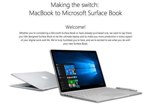 I note MS are pumping a more humble “Switch” campaign than Apple rocked out in the early 2000’s. I looked into switching and decided against the amount of conscious decoupling I’d need to do from the Apple ecosystem. Never mind the image of Balmer’s crazy eyes and sweating face I can’t get out of my head from that conference every time I see the Start button

 So I began to get mildly interested when Speedo launched their Aquabeat MP3 players integrated into their goggles some years back – latest product spec
  Surely the next step is to stretch into a different product category and develop underwater Google Glass?! Simply acquire an
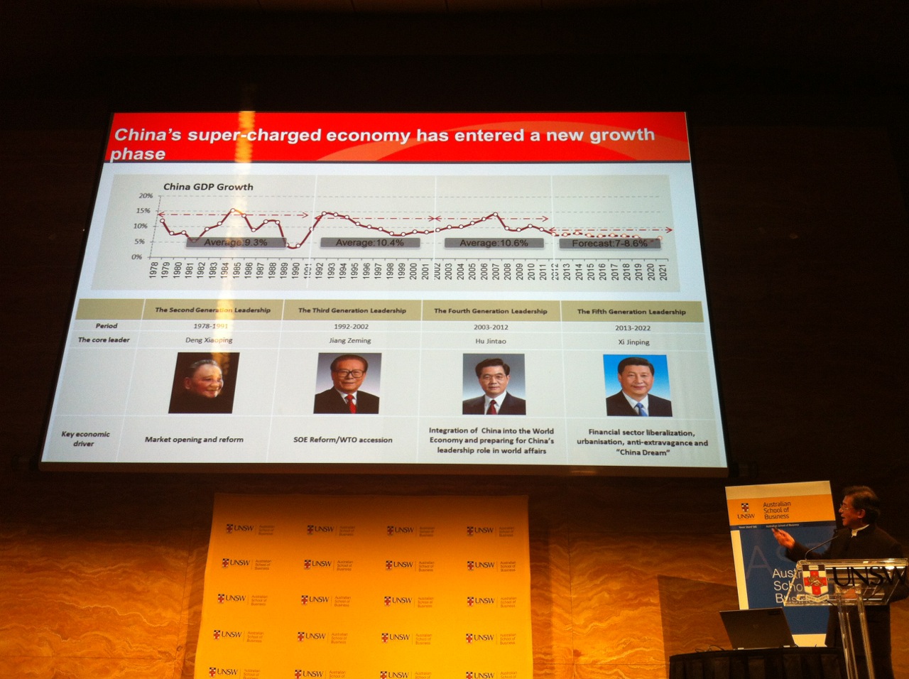
 Attended an interesting and very frank presentation by Chinese property tycoon Vincent Lo at UNSW tonight.